
Written May 22, 2015. Tagged Apple Watch.

I've had my Apple Watch for 2 days now. These are some random observations so far.
I hear you can get these cheaper than $349, but having the current time a wrist-raise away is very convenient. The wrist-raise detection (turning the display on only when needed, to save battery) has worked almost flawlessly for me – I have no complaints.
The Apple Watch is in some ways less beautiful to me than the mechanical Raketa watch I used to sometimes wear, but I like having a digital watch face. When I see an analog watch face, I convert it to digital in my head.
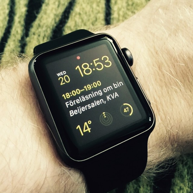
Having the date on your wrist (this can also be had for less money) is convenient. When I bought milk, I checked the best-before date against today's date in the wink of an eye.
When I went out for an evening walk, I glanced ever so briefly at the temperature to see if I needed a jacket.
Seeing the next calendar appointment is also pretty neat.
I mostly use the "Modular" watch face.
Before I got my watch, I thought the Mickey Mouse watch face just looked silly. But on the actual device, it might be my second favorite. The saturated red, yellow and white against black looks really good.

I had expected the screen to be a bit crappy, and that the pixels weren't as "close to the glass" as on the iPhone, but the OLED screen looks unreal in the best way.
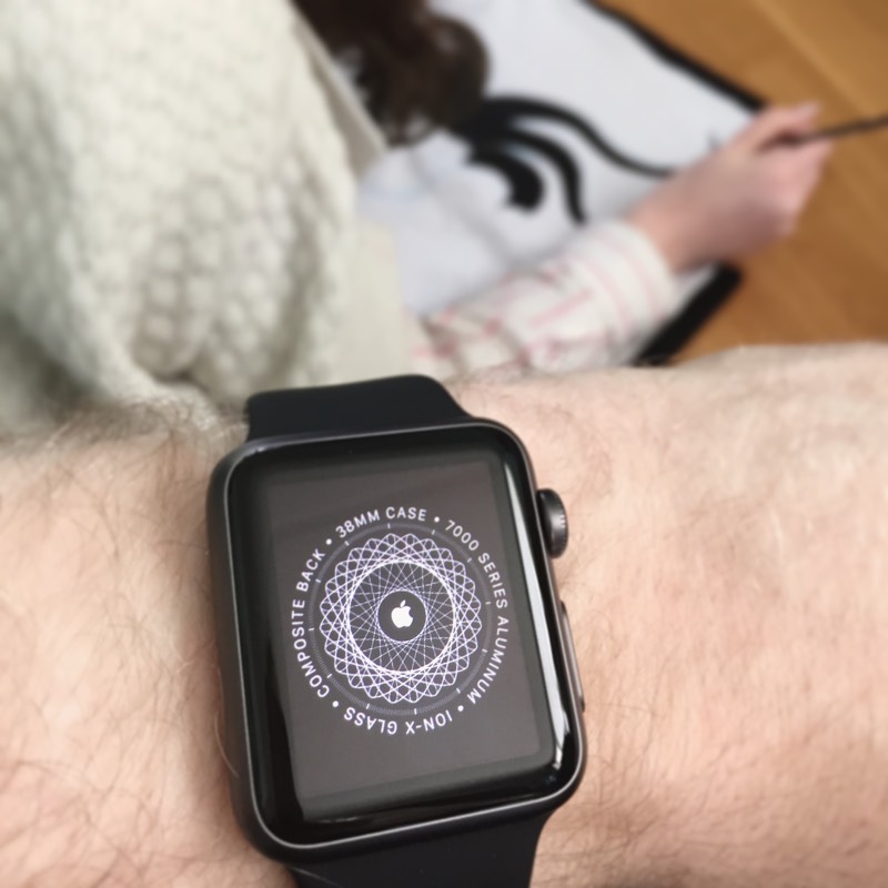
When the circle-of-specifications appeared after pairing the watch, I was wowed at how it seemed to pop out of the screen.
Perhaps due to the very black blacks, the picture on the screen looks to me almost like it's hovering a hair above the screen. Photos don't do it justice.
Moving Siri from your pocket to your wrist is surprisingly significant. You just lift your wrist, press the crown and speak. (Or say "Hey Siri", but that's iffy and then you feel stupid.)
I do "remind me to X in 5 minutes", "remind me to Y at 11:30" several times a day now. Today at work I promised to look at something after lunch, so I quickly added a reminder. On my way home I saw a poster for an interesting event, so I lifted my wrist and added it to my calendar.
She's also great for looking up random stuff. "When is Mother's Day?", "Where is Burundi?"

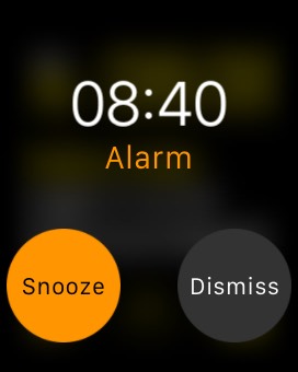
When the alarm clock on your iPhone rings, you can turn it off from the watch. I've wanted this so much and didn't even realize the watch could do it until it happened, despite having read a lot of reviews.
I often rise before the alarm, especially in the weekends. If I leave my phone by the bedside, the alarm may ring when I'm in the bathroom or at the kitchen table. This is annoying to me and my sleepyhead girlfriend both.
I've wanted this feature to the point that when I had a jailbroken iPhone for a while, I installed software so I could share the iPhone screen remotely from my computer or iPad to turn alarms off. Unsurprisingly, this wasn't nearly convenient enough that I stuck with it.
I stopped by the grocery store after work today and sent a message from my iPhone to my girlfriend, asking if we needed milk.
A minute later, phone back in my pocket, I felt a light tap and saw her reply on my wrist. She suggested some more purchases, and I replied with the standard "OK" right from the watch, in two taps.
I was meeting up with a friend yesterday and on my way there I could see her messages on my wrist, without breaking my stride.
This may seem like a tiny convenience, but there's something about the unbroken flow of it that I really enjoy.
I got a phone call while I was doing things in the kitchen, so I answered it right on my wrist. The sound quality was fine (but might not be in a noisier environment).
Then when the phone call went on for longer, I just handed it off to my phone seamlessly and kept talking there.
When I tried map directions two evenings ago, it worked well and was super cool.
I set up the route on my phone, and the next time I raised my wrist, the directions were there. It's beautiful how it counts down the distance to the next turn and then taps you (with different taps for "left" and "right") a short while before it's time to turn.
But then when I played with it again today in the neighbourhood of the office, the directions were all confused, and it didn't show the right instructions. I'm not sure if I did something wrong or what. I'll experiment more with it and see if I can figure out what happened.
I must mention the Prank Watch app. The app description and screenshots do their best to hide this from Apple's reviewers, but it's essentially a fart app from the future. You launch the app on your phone and hide it somewhere (unlocked, so the app remains active). Then you can trigger a fart sound remotely from your watch. Or a monster sound, or several others. It's silly but brilliant.
You can receive a notification on your wrist when your phone battery is fully charged, or running low. You can be notified when a heavenly spotlight is about to fall on you.
Siri is pretty great, but she has some annoying knowledge gaps. You're inexplicably referred to the phone when you ask about birthdays and ages. You can ask "What am I doing on May 25th?" but no more than 6 days ahead.
I would love to look up English words in WordBook, but the dictation only accepts Swedish, which is my Siri language. I'm not sure if this is a shortcoming of the watch or of that app.
Sometimes the quick-reply options in the Messages app are English, sometimes Swedish, and it doesn't always get it right. Once, dictation for a message to a Swedish contact expected English, though I haven't been able to reproduce it since.
I wish you could force touch from the reply view to get a language picker.
Today, battery life has been fine. As I write this around 7:30 in the evening, having worn it some 12 hours, I'm at 40%. (As I edit this passage at 10:30, it's at 17%.) I've interacted with it fairly frequently throughout the day, checking the time, interacting with notifications, adding reminders and such.
Yesterday, the battery gave out around 10 in the evening, an hour before bedtime, after around 15 hours of use. I did track a 15 minute run (which measures your pulse more frequently, and thus uses more battery) but Apple's own battery testing got more battery life with more exercise. Maybe I just used the watch a lot: it was my first full day with it (having received it the previous evening). Or maybe calibrating the watch on the first run burns more battery.
The fact that I need to worry about the battery making it through the day is certainly a major downside, for a device meant to be worn all the time.
My phone battery has run out much faster since I got the watch. It used to get through the day fine, but yesterday I had to charge it on my way home from work.
It's possible that part of this is down to plugging the phone in less at work since I don't need the phone on my desk for notifications anymore. I'm not sure.
Short interactions on the watch are great. Notifications, a quick reply to a message, checking your step count, changing the song.
Long interactions can be fiddly, and are more appropriate for the iPhone. I love getting a notification when my girlfriend posts on Instagram, but scrolling through my Instagram feed on the watch isn't a good experience. It's great if you treat it as a super-powered watch; it's not a smaller iPhone.
The app launcher screen itself is not very convenient to use, especially if you're on the go. Icons are small and the lack of labels makes them harder to identify.
If you launch the Workout app from the app launcher and then want to see or change the song in the Now Playing glance, you have to press the crown three times (back to launcher, then re-center launcher, then switch to watch face). Then swipe down and to the right glance. Then press the crown once (back to watch face) and then double-press it (back to last app). A bit fiddly.
The app launcher is also unnecessarily crowded. There are apps I only want to access via complications (Activity, Weather, Calendar), glances (Pedometer++), or through notifications (Instagram). There are built-in apps (Stocks) I don't use. So why are they in the app launcher where space is at a premium? The companion app on the iPhone lets you toggle glances on and off per app. I wish I could do the same for app launcher icons.
Well, just one that I've noticed: the Pedometer++ glance shows me my step count, but it will often freeze, showing an old state and a spinner, until I give up after 10 seconds or so and just tap it to launch the app instead.
I blogged about this yesterday.
I love the taptic feedback, but the single taps for notifications are a bit too unintrusive and could stand to be slightly stronger. Much of the feedback is very noticeable, though – you will notice when a timer reaches 0.
I think the 38 mm watch was a good choice aesthetically – I haven't seen the 42 mm in real life, but judging by a paper dummy and photos online, it would look too big on me for my taste.
For some reason, I keep trying to swipe to the right from the watch face to the apps. This doesn't work: you need to click the crown. I guess I picture them as being side-by-side.
I thought the built-in weather app was a bit painful to use, because you had to force touch and then tap to switch between conditions, temperature and chance of rain. Turns out you can just tap the weather circle and it rotates between these modes.
I wish Siri supported something like "Note to self: bla bla". I make so many of those through Captio on the iPhone, but having it on the wrist would be amazing.
So far, I mostly love the watch. It's definitely not a necessity, but adds some convenience and some fun if you've the money to spare.
That's it for this post. I might write about it again when I've had it for longer.